You can use this page to explore visitor attendance, sales data, customer retention and metrics related to passes & events. Unlock the power of data-driven decisions and make informed choices for your climbing gym's success.

To access valuable insights for your gym's performance navigate to the Insights section, from the navigation pane on the left-hand side.
Adjust the date range to focus on specific periods.
Adjust the chart view to daily, weekly or monthly.
Select the metric you want to explore from the available options:
General, Visitor Attendance, Sales data or Retention.
 Always click refresh after adjusting the chart filters.
If you need to share or work with the data externally, utilize the export feature to save the insights as reports or files.
Select the date range you wish to export.Always click refresh after adjusting the date range.
Click Download .csv, to download a .csv file of the data.
Click Export passes, to download all pass types with expiration > 1 day of this date range.
General insights provide an overview, setting the stage for more in-depth analysis of your gym's data insights; available on the Club Tier & above.
Spend Per Unique Customer
This metric represents the average amount spent by each of your unique customers. It's a crucial figure, indicating how effectively you attract and retain customers and encourage their spending within your gym.Spend Per Visit
This metric reflects how much your customers typically spend during each gym visit. A higher figure signifies that customers are actively engaging with your services and making the most of their visits.Total Spend
This metric is your total revenue, showing the collective sum of payments made by all customers during the given period. This value is essential for tracking your gym's financial performance.Total Visits
This is the total number of visits to your gym, during the specified date range. Monitoring this figure is valuable for assessing customer engagement and the overall utilization of your facilities. Note, a single profile can visit multiple times.Unique Customers
This statistic reveals the number of individual clients who contributed to your gym's revenue.
This section delves into two critical aspects of your gym's performance:
Attendance by Customer Type:
This insightful graph categorises your visitors into distinct customer types, enabling you to gain a deeper understanding of your clientele.
Total: This represents the total number of visitors during the specified period, giving you a comprehensive overview of gym attendance.
Addicts: Customers whose previous visit occurred less than 2 days ago. These dedicated gym-goers show high engagement levels, visiting frequently.
Regulars: This category includes visitors whose previous gym visit was within the past 7 days. Regulars are committed patrons who consistently engage with your gym's services.
Casuals: Customers who returned to the gym within 4 days of their previous visit. This group falls in between addicts and regulars, indicating consistent but slightly less frequent visits.
Sporadic: Those whose previous visit was seven days or more before the current visit. Sporadic visitors might need more incentives to engage consistently.
First Timers: These are customers who have just made their first-ever visit to your gym. First-timers present an opportunity for growth as you aim to convert them into regular clients.
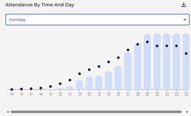
Attendance by Time and Day:
This section displays a bar graph showcasing visitor attendance trends based on the time of day, with average customer counts on the y-axis.
You can refine these insights using a day-of-the-week filter to understand attendance variations and optimise your gym's operations for better customer experiences.
You can also download the data to get the raw numbers behind this chart, to get the hourly attendance.

If your attendance graph shows climbers staying in the gym for extended periods, it's likely because you're not checking out your climbers. When climbers aren't checked out, your Attendance by Time and Day graphs become cumulative rather than showing actual busy periods.
BETA always recommend checking out climbers as they leave your facility. This not only provides more accurate attendance data but also creates another valuable touchpoint with customers as they exit your climbing gym.
This section offers a comprehensive overview of your gym's financial performance. Analysing this data can help you identify areas of growth, pinpoint cost inefficiencies, and guide you to make informed decisions to enhance profitability and long-term sustainability.
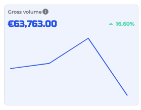
Gross Volume and Trend Analysis
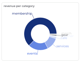
The line graph depicts the gross revenue within your selected date range. It also features an estimated linear trendline slope relative to the mean revenue over the given period, helping you assess your gym's financial trajectory.Revenue Breakdown (per price category)
The pie chart categorises your revenue into membership, events, cafe, gear, and services, offering a clear overview of your income sources.Average Sales per Hour (Excluding Events)
The table highlights your average sales per hour, excluding events, allowing you to gauge your gym's regular sales productivity during different hours of the day.
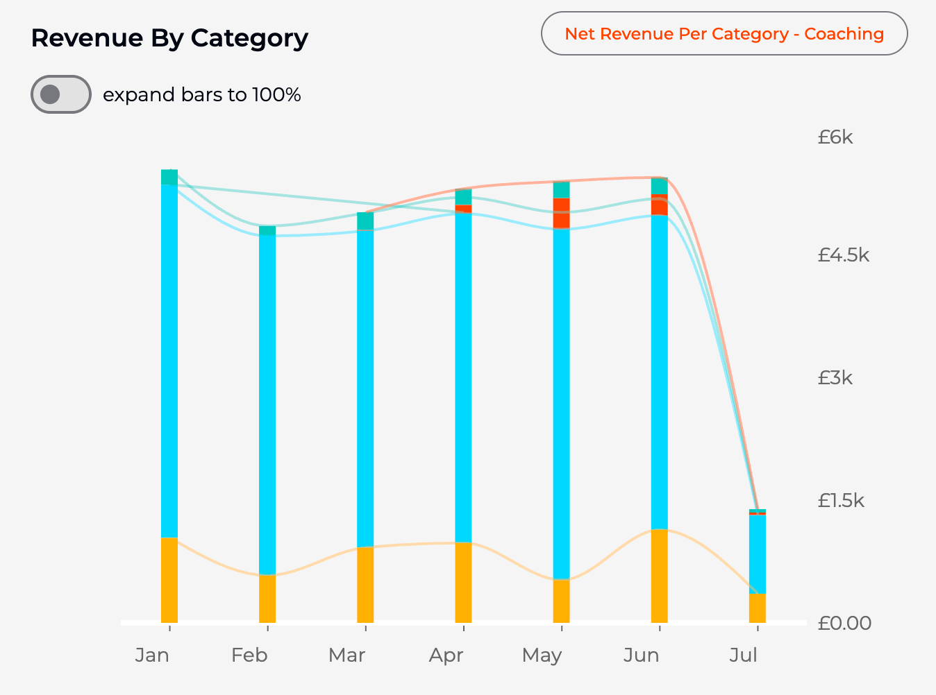
You can filter by transaction state:Revenue By Category
This graph displays revenue segmented by category, allowing a clear comparison of how each category contributes to total income. It highlights top-performing categories and identifies areas with lower revenue, supporting data-driven business decisions for resource allocation or marketing focus.
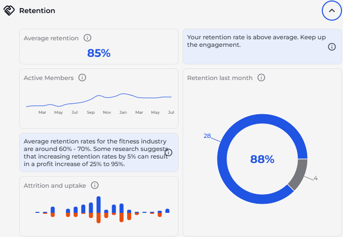
Member retention data shows member patterns over time.
Average Retention Percentage
This metric reveals the average retention rate over the past 20 months, providing insights into your gym's ability to keep customers engaged and satisfied.Active Members and Membership History
This section offers a detailed view of your active members, tracking their membership history over the past 18 months. It helps you understand the dynamics of your customer base.Attrition and Uptake
The month-on-month attrition (red) and uptake (blue) graph allows you to visualise how customer numbers fluctuate over time. This information can guide strategies for retaining members and attracting new ones.Retention Last Month
The chart shows the retention rate for the previous month, indicating the effectiveness of your recent customer retention efforts.
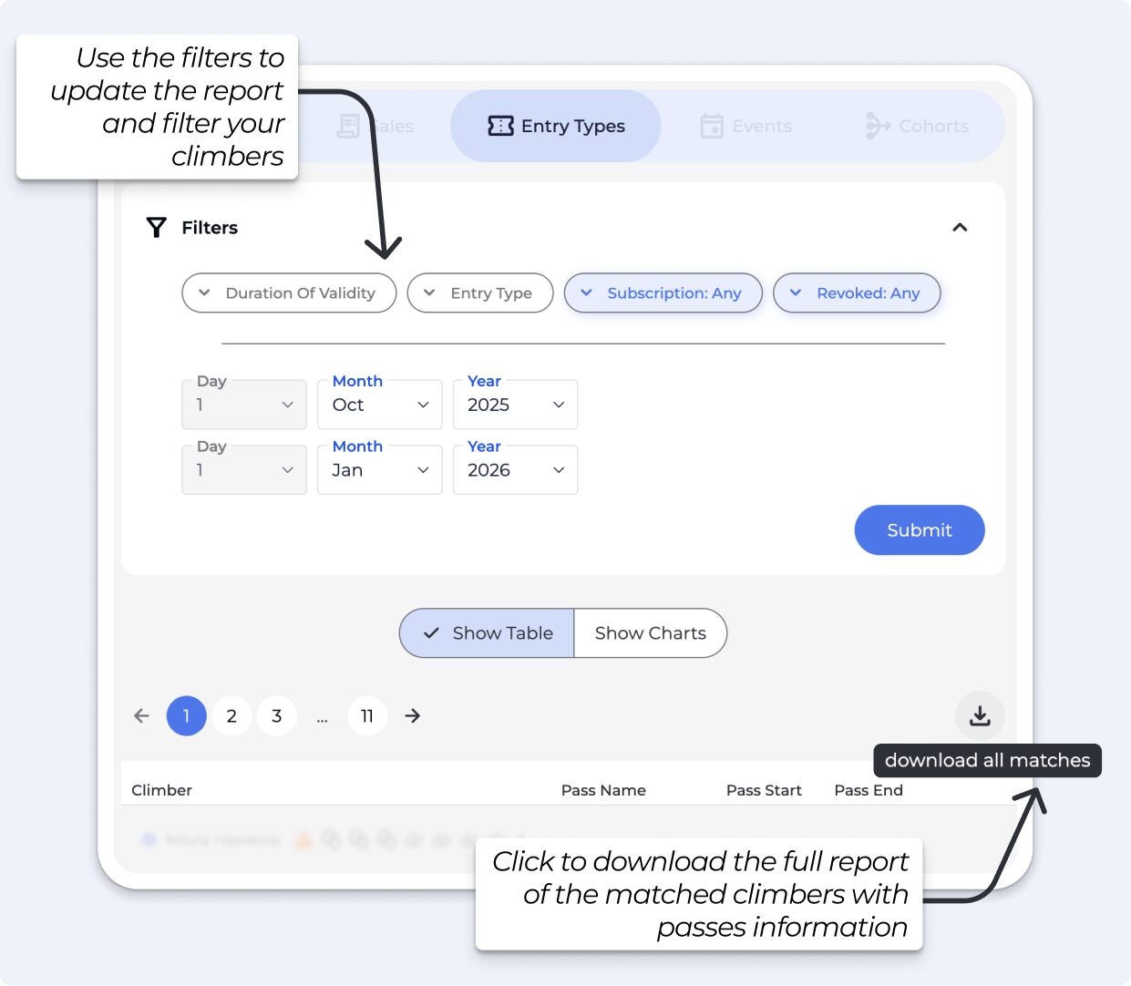
The Entry Types Insights helps you analyse visitor entry patterns at your climbing gym.
Available on the Business Tier & above.
Here's how to use it effectively:
First, filter by a time period to narrow down the results.
Set both From and To dates for the exact window you want.
After changing filters, click refresh to update results.
Additional Filters
Duration of validity: Filter passes based on their active period
Entry type: View specific entry categories
Subscription: Filter by subscription status (default: Any)
Revoked: Include or exclude revoked passes (default: Any)
These filters help you gain precise insights into who is entering your gym and what types of passes they're using, allowing for better operational planning and marketing strategies.
Table: Shows a list of climbers within the selected period. Here's an explanation of each column in the table:
Climber: This column lists the individual climbers or gym members who visited during the selected period.
Pass Name: This shows the type of entry pass or membership that each climber used to access the facility (such as day pass, monthly membership, etc.).
Pass Start: This indicates the date when the climber's pass or membership began its validity period.
Pass End: This shows when the climber's pass or membership expires or ended its validity period.
Download: Click Download .csv to export the table.
Chart: Shows totals for the selected period. Click a bar to see the subset of profiles for that slice.
Group by GYM: This option groups your charts and tables by each location. For single-location sites, this will show totals. ATTENTION: You need to be at the main dashboard to see data for each location.
Group by ENTRY TYPE: This option groups your charts and tables by each entry type. You can use the coloured filters above to filter out what you don't wish to see or to change the entire view. When setting up your filter at the top, make sure to select only the entry types you wish to see, rather than including all types.
Chart Views: Toggle between NEW, CHURN, and RENEWED metrics. A NET CHANGE view is also available for each metric.
New » The number of people who had a pass matching the filters in the given period and did not have a pass matching the filters in the previous period.
Churn » The number of people who had a pass matching the filters in the given period and did not have a pass matching the filters in the subsequent period.
Renewed » The number of people who had a pass matching the filters in the given period and in the subsequent period.
Net Change » The net change in the number of people having a pass matching the filters in a given period.
Use the Entry Types report to get a full export of pass and subscription data for your gym. You can download this from Insights → Entry Types → Show Table using the download button.
Description | |
pass_key | The unique ID for this specific pass record in BETA. |
climber_key | The unique ID for the climber profile this pass belongs to. |
first / last | The climber's first and last name. |
The email address on the climber's profile. | |
dob | The climber's date of birth. |
phone | The phone number on the climber's profile. |
address | The climber's address as stored on their profile. |
membership_type | The name of the pass or subscription product (e.g. Six Month Recurring, Day Pass). |
pass_start | The date the pass became active. |
pass_expiration | The date the pass expires. Blank if the pass is open-ended or on an active recurring subscription. |
pass_pause | The date the pass was paused, if applicable. |
pass_resume | The scheduled resume date after a pause, if applicable. |
pass_duration | The billing interval for recurring subscriptions (e.g. |
entries_permitted | How many entries the pass allows. |
entries_used | The number of entries consumed from this pass. |
entries_gifted | The number of complimentary entries added to this pass outside of the standard allowance. |
pass_status | The current state of the pass: |
purchase_location | The location where the pass was sold. In multilocation setups, this shows which gym the sale was attributed to, regardless of which location filter is active. |
First select an Event template and a time period. The results below reflect only events that match that template within the chosen dates. Available on the Business Tier & Above.
Total Events: The number of distinct event instances scheduled in the period.
Count Sold: Total number of tickets or spots sold across those events.
Value Sold: Gross revenue from sold tickets for those events in the period.
Average Value: Average revenue per ticket sold in the period.
Total Participations: How many attendances were recorded across all matching events in the period.
Unique Participants: Distinct people who participated in at least one matching event in the period.
Average Occupancy Rate: Average percent of capacity filled across the events in the period.
Shows daily totals for the selected template and period. Use this to spot booking trends, spikes after announcements, or slow days.
Attended: Count of attendees who were marked as attended on that date.
Enrolled: New enrolments created on that date, regardless of later status changes.
Cancelled: Enrolments that were cancelled on that date.
Sales: Revenue booked on that date for enrollments into the selected events.
Total Capacity : The combined seat capacity of all matching events for that date, useful as a ceiling reference to read occupancy.
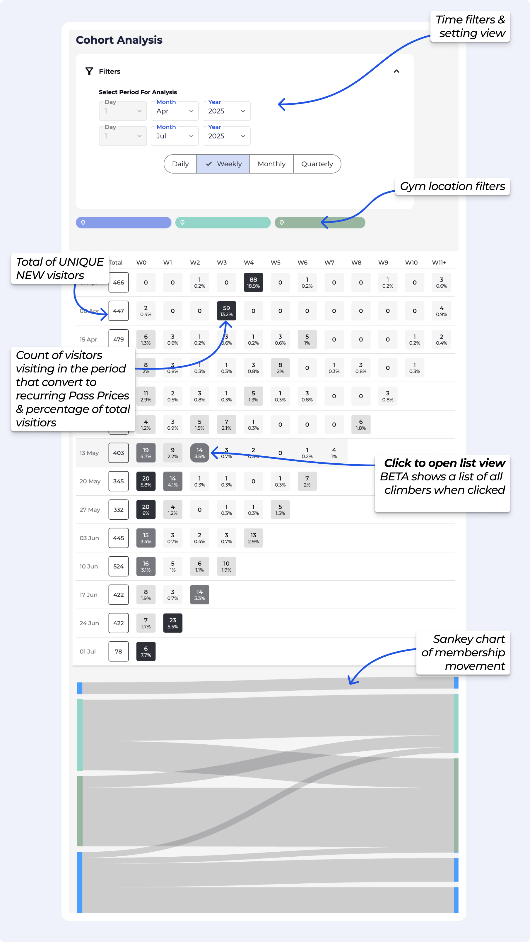
A cohort graph groups of visitors based on when they first did something — in this case, when they first visited your gym — and then tracks what percentage of that group later completed another action, namely purchasing a subscription.
The chart helps you understand the conversion timeline from first visit to subscription signup. By analysing this data, you can see how long it typically takes visitors to become recurring subscribers and use those insights to improve your marketing and retention strategies.
This relates to day, week, month or quarter - ie your time filters selected. These are the numbers of day, week, month or quarter shown on the left hand side of your chart. eg 01 Apr, W0 implies 01 Apr - 07 Apr and W1 implies 08 Apr - 14 Apr
Since the descending column is closer to today's date - the closer that date is, the fewer time periods (eg weeks) there are from that date to today. Basically, less time has
To access valuable insights for your gym's performance navigate to the Insights section, from the navigation pane on the left-hand side.
Adjust the date range to focus on specific periods.
Adjust the chart view to daily, weekly or monthly.
Always click refresh after adjusting the chart filters.
Cohort Totals: Shows the number of unique visitors who checked into the gym during a specific period (e.g., first week of July). These are grouped by their first visit date.
Time Columns: Displays both the count and percentage of visitors from each cohort who purchased a recurring pass (converted to members).
Colour Gradient: Darker colours indicate higher conversion rates in that time period. The intensity of the colour helps you quickly identify successful periods.
Sankey Chart: This visualization is particularly useful for multi-location facilities, as it illustrates member movement between different locations.
The Cohort Graph structure helps visualize how quickly and effectively new visitors convert into recurring subscribers over time. Some key insights from the example cohort analysis:
The week starting 01 April showed exceptional performance with 18.9% of unique visitors converting to members - this likely corresponds to a specific promotion or event that drove higher conversion rates.
The weeks starting 15, 22 and 29 April displayed standard performance patterns with no significant conversion spikes - averaging approximately 0.6% conversion per subsequent week.
BETA offers two main ways to view and analyse your data: Insights and Reporting. Each serves a different purpose, depending on how you want to use your data — whether it’s for quick checks, or for long-term strategic KPI analysis.One of the most important things to understand is how often your data refreshes: Tip: If you're ever unsure where to look, just ask: Do I need this data now, or am I trying to track something over time? Insights for real-time answers, and Reporting for deeper analysis. Insights are updated in real time. If you're using Insights to check daily sales, view activity in a product, or monitor registrations, you’re seeing the most up-to-date information available. Anywhere you see the Insights button (
 ️), the data is live and continuously refreshing.Reporting, on the other hand, pulls from a larger, historical database (including migrated data). This makes it ideal for tracking long-term trends and KPIs. Because of this, some reporting data may be delayed — in some cases, up to 24 hours from the last time it was viewed.
ClimbersThese queries focus on individual profiles — they answer the question relating to “How much climbers ____?”. e.g., tracking their activity, progress, or engagement over time. Use Climbers queries to analyse behaviour like attendance patterns, membership duration, or performance improvements.SessionsSessions queries look at visit data. — they answer the question relating to “How many times did climbers ____?”. They help you understand how often and when members are using the gym. Ideal for analysing peak hours, class popularity, or usage trends across different times or days.ProductsProduct queries focus on what's being sold— they answer the question relating to “How much products were ____?”. e.g., memberships, class packs, merchandise, etc. Use these to track sales performance, identify best-selling products, or monitor revenue trends tied to specific offerings.TotalsTotal queries return financial data — they answer the question relating to “How much revenue ____?”. They aggregate data across different categories to give you a snapshot of overall performance such as total revenue, number of sessions, or member count within a selected time frame.
The net revenue report doesn't update at a fixed time each day. Instead, it updates automatically when someone opens the reporting page, but only if it's been more than 24 hours since the last update. Therefore, if the report was already updated within the past 24 hours, it will just display the existing data without recalculating.Let’s say you open the query in the reporting page at 3:00 PM on Monday. That action triggers the data to update. You then open this again before closing at e.g., 08:00 PM - it will still show the same data, because it hasn't been 24 hours yet. But if you open the page at 3:01 PM on Tuesday or later, the report will update again automatically, showing up-to-date data.
In BETA, individual passes or transactions would not be visible under climbers’ profiles as only total figure (such as total revenue, total visits etc) can be migrated. However, this totals data can be accessed from the reporting dashboard as queries. Attention: What can be migrated and how also depend on the software you have migrated from.
Yes, you can export this information via the Insights page » Passes page. All you need to do is choose a time period using the time filter and download the information in a CSV format. This will provide information on pass purchases per pass type and per climber.
Guest entries are easily differentiated in a separate column called is_guest in the exported file.
By default your insights group customers by time since their last visit.
These are the five categories:
Addicts: Time since their last visit is less than two days.
Regulars: Time since their last visit is less than four days.
Casuals: Time since their last visit is less than seven days.
Sporadic: Time since their last visit is more than seven days.
First Timers: They only visited the gym, once!
Example; If Alex H. visits the gym every other day, he is an Addict. While Tommy C. visits every week, meaning he is characterised as a Sporadic climber.